<-- this is shared/teaser/slider-teaser.html.erb -->
Homepage
The FHinder homepage is geared towards quick and convenient discovery with a prominent search bar and convenient navigation that offers instant access to listings, favorites, and other user account features.
Hero Section:
The hero section clearly portrays the central concept of FHinder, which is to assist students in locating items of other students within a secure framework of the university. A robust call to action urges the user to start exploring immediately.
A preview grid is used to display the listings, and users can see the listings with relevant information like image, title, and price, making it easy to work with the application.
A separate "Create a Listing" section encourages the user to contribute their listings, which essentially promotes the overall sense of community.
Finally, the section “How it works” helps users understand the process in a simple flow of three steps: Search, FHind, and Connect.

Listings
Central to the FHinder interface, and exclusively designed for fast filtering and overview, is the listings page. Helpfully, a sidebar helps the user sort and refine results by status, location, and category, making it easy to drill down into results that suit your needs.
They are presented in a structured or organized list format, indicating large images, titles, short descriptions, and prices. Each listing includes quick links to the detail page, as well as additional icons that allow users to mark items as favorites or edit and delete items depending on their owners.
This arrangement prioritizes the readability and ease of scan, making it easy to compare information across several offers. This, combined with the options of sorting and filtering, facilitates the search for specific items.
Overall, this perspective serves to minimize friction during the browsing process and facilitate the smooth transition of the user to the relevant listings.

Profile
The profile page gives the user a personal overview of their activities within FHinder. At the top, key information like the user name, study program, and visual avatar create a clear identity within the platform.
Statistics provide insights into the number of current and sold listings, thus enabling quick feedback from the participation in the marketplace. It serves as an overview to track user activities at a glance.
Below is the "My Listings" section, which displays all items that have been posted by the user. With each listing card, it offers direct access to details and provides management actions like editing or deleting, making it easy to maintain and update offers.
A clearly visible "Create new listing" button invites further contribution, reinforcing FHinder's identity as an active, student-driven exchange platform.
In all, the profile page puts together in a single space identity, overview, and management features.

Favorites
The favorites page will list all the listings a user has set for later, thereby creating a personalized shortlist of interesting items. This allows users to easily return to offers they are considering without having to search again.
Listings here are presented in the form of visual cards, together with images, titles, and prices for easy, quick perception. Each card refers directly to the detail view, while the favorite icon enables users at any moment to remove an item from their list.
The layout mirrors the browsing experience, thus it is familiar and easy to navigate through. A “Create new Listing” button can always be displayed to encourage users to stay active not just as buyers but as contributors too.
The page supports decision-making by keeping relevant items in one convenient place and reducing friction in the discovery process.

Create Listing
The create listing page allows users to add new items to FHinder by using an understandable and well-structured form, with major information like the title, price, and description placed at the top of the page.
The user has the option to upload a cover photo and other gallery photos to illustrate the product they are trying to sell. The label fields are flexible enough to accommodate various attributes, making this template suitable for various products with different structures.
Other options allow users to specify the position of the item, its status, category, and expiration date. This helps to keep the listings organized, manageable, and relevant to fellow students.
The design is highly conducive to clarity and usability. There is a clear reduction in friction in the posting process. The save button is prominently placed to ensure active participation in the student marketplace.

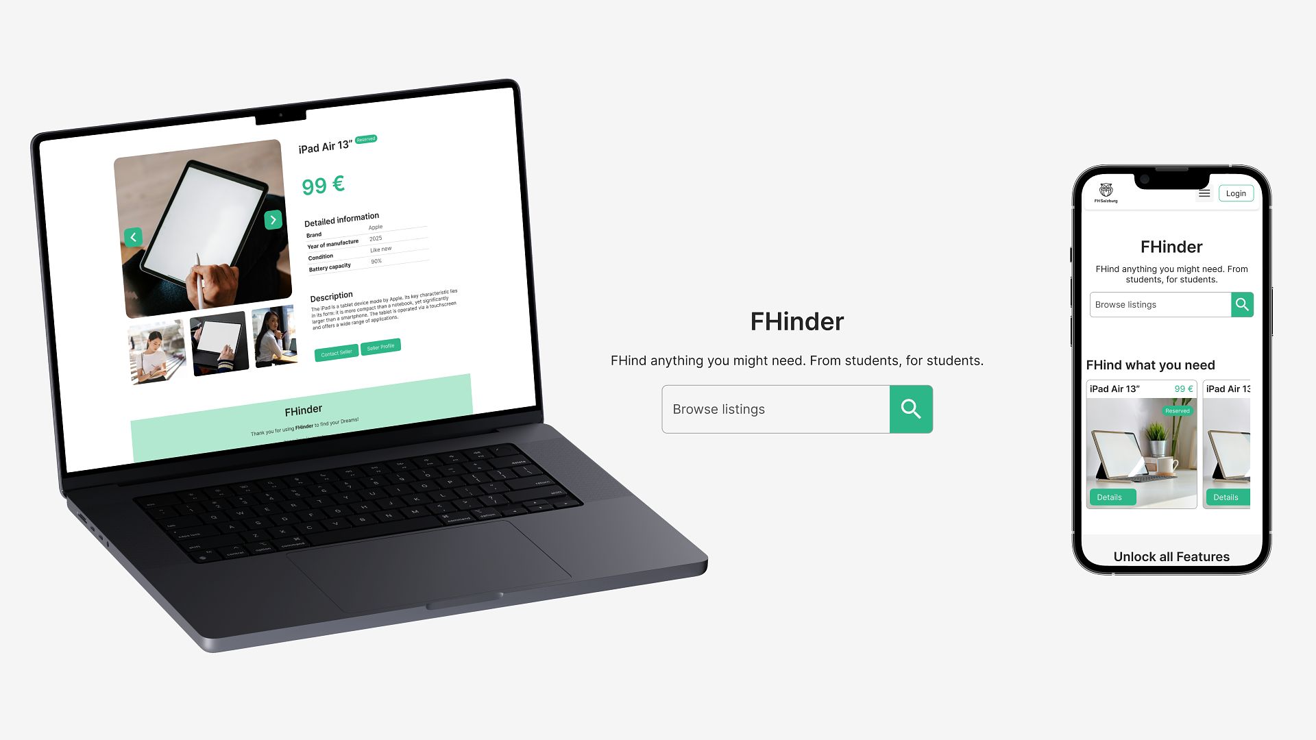
Listing Detail View
The listing detail page gives a focused view to one particular item. A big main image is used for the visual highlighting of the product, with additional thumbnails supporting quick image switching.
Key information like the title and price is prominently displayed so users immediately understand what is being offered. Structured details, including custom attributes for brand, are presented clearly, followed by the full description.
Two main user actions for the next step in the user journey are to contact the seller or visit the seller's profile. This enables direct communication and trust-building by showing transparency through one's profile.
A layout like this minimizes distractions, allowing the item itself to take center stage and enabling users to make informed decisions more quickly and confidently.